Braid
A UX research and design partnership to make Braid, an open-source vocational storytelling platform built at the University of Michigan, clearer, easier, and more inclusive to use.
IMPACT AREA
Public Interest Technology
CLIENT
Braid (PIT-KN · MIDAS)
YEAR
2024 - 2025
DELIVERABLES
Competitive Analysis
Heuristic Evaluation
Interaction Map
OVERVIEW
Braid is an open-access, open-source storytelling platform built at the University of Michigan with support from the Public Interest Technology University Network (PIT-UN) and MIDAS. It lets students, instructors, researchers, and practitioners share their vocational journeys and "braid" their stories onto others', trading social-media engagement metrics for deeper, more meaningful connection around the "muddy middle" of a career rather than just the milestones. Tech for Social Good partnered with the Braid team to evaluate the platform's user experience and chart a path toward a clearer, more inclusive 2.0.
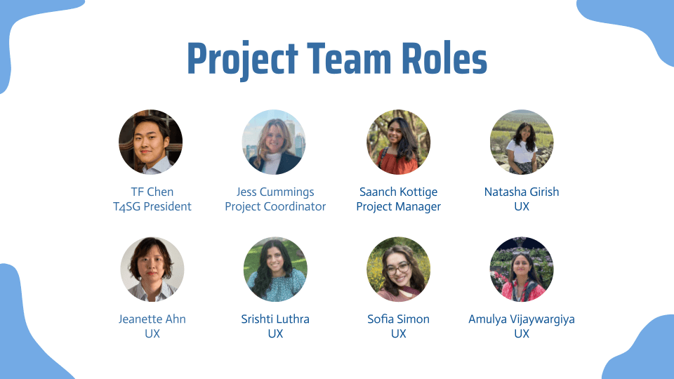
T4SG PROJECT TEAM
Project Manager · UX Researchers
UX Designers

CHALLENGE
Braid's mission is to make knowledge-sharing authentic and joyful, but its interface got in the way. Core terms like "braids," "reactions," and "trailheads" went unexplained, users often couldn't tell which screen they were on or how to get back, and missing feedback (no confirmation when a post published, no message when a required title was left blank) left people guessing. So how might we surface Braid's unique value while making it intuitive enough for a first-time user to navigate with confidence?
WHAT WE DID
We ran a full UX evaluation of Braid. We benchmarked it against platforms like Canvas, Reddit, LinkedIn, Padlet, Slack, and Discord to sharpen what makes Braid distinct, mapped every screen and interaction to locate points of friction, and conducted a heuristic evaluation that surfaced and severity-ranked usability issues across the Home, Profile, and Explore screens. From there we prioritized the critical fixes, navigation breadcrumbs, clear error and success messaging, and in-app documentation for Braid's terminology, and outlined a vision for Braid 2.0.



OUTCOME
A prioritized set of usability findings and a concrete redesign roadmap for Braid 2.0, giving the team a research-backed path toward a more intuitive, inclusive platform, along with clear next steps in user research, usability testing, and redesign.
Braid
A UX research and design partnership to make Braid, an open-source vocational storytelling platform built at the University of Michigan, clearer, easier, and more inclusive to use.
IMPACT AREA
Public Interest Technology
CLIENT
Braid (PIT-KN · MIDAS)
YEAR
2024 - 2025
DELIVERABLES
Competitive Analysis
Heuristic Evaluation
Interaction Map
OVERVIEW
Braid is an open-access, open-source storytelling platform built at the University of Michigan with support from the Public Interest Technology University Network (PIT-UN) and MIDAS. It lets students, instructors, researchers, and practitioners share their vocational journeys and "braid" their stories onto others', trading social-media engagement metrics for deeper, more meaningful connection around the "muddy middle" of a career rather than just the milestones. Tech for Social Good partnered with the Braid team to evaluate the platform's user experience and chart a path toward a clearer, more inclusive 2.0.
T4SG PROJECT TEAM
Project Manager · UX Researchers · UX Designers
CHALLENGE
Braid's mission is to make knowledge-sharing authentic and joyful, but its interface got in the way. Core terms like "braids," "reactions," and "trailheads" went unexplained, users often couldn't tell which screen they were on or how to get back, and missing feedback (no confirmation when a post published, no message when a required title was left blank) left people guessing. So how might we surface Braid's unique value while making it intuitive enough for a first-time user to navigate with confidence?
WHAT WE DID
We ran a full UX evaluation of Braid. We benchmarked it against platforms like Canvas, Reddit, LinkedIn, Padlet, Slack, and Discord to sharpen what makes Braid distinct, mapped every screen and interaction to locate points of friction, and conducted a heuristic evaluation that surfaced and severity-ranked usability issues across the Home, Profile, and Explore screens. From there we prioritized the critical fixes, navigation breadcrumbs, clear error and success messaging, and in-app documentation for Braid's terminology, and outlined a vision for Braid 2.0.
OUTCOME
A prioritized set of usability findings and a concrete redesign roadmap for Braid 2.0, giving the team a research-backed path toward a more intuitive, inclusive platform, along with clear next steps in user research, usability testing, and redesign.